🐜 Getting started using Ant Design with ASP.NET Core, React and Redux
China has a vastly different array of technologies that are used daily. One of the most popular libraries in recent years has been Ant Design. Ant Design is a set of UI components originally designed for the React ecosystem. The great thing about Ant Design is that it has a robust set of components and is very comprehensively documented in both English and Chinese!
Today I’m going to take you through the initial experience I have had getting Ant Design up and running. For this example, I have built a small React app based on the Microsoft ASP.NET Core + React + Redux template.
To install it, run the following command in the vs code terminal:
dotnet new reactredux
From there, I have added a simple User Profile component for displaying dummy user information. Here is the code I started with inside the UserProfile component:
UserProfile.tsx
import * as React from 'react';
import { connect } from 'react-redux';
import { RouteComponentProps } from 'react-router';
import { ApplicationState } from '../store';
import * as UserProfileStore from '../store/UserProfile';

type UserProfileProps =
    UserProfileStore.UserProfileState
    & typeof UserProfileStore.actionCreators
    & RouteComponentProps<{ startDateIndex: string }>;

const { Meta } = Card;

class UserProfile extends React.PureComponent<UserProfileProps> {

    public componentDidMount() {
        this.ensureDataFetched();
    }

    public render() {
        const {
            userProfile: {
                FirstName,
                Surname,
                JobTitle,
                Description
            }
        } = this.props;

        return (
            <React.Fragment>
                {FirstName} {Surname}<br/>
                {JobTitle}<br/>
                {Description}
            </React.Fragment>
        );
    }


    private ensureDataFetched() {
        this.props.requestUserProfile();
    }
}

export default connect(
    (state: ApplicationState) => state.userProfile,
    UserProfileStore.actionCreators
)(UserProfile as any);
UserProfile.ts
import { Action, Reducer } from 'redux';
import { AppThunkAction } from '.';

export interface UserProfileState {
    isLoading: boolean;
    userProfile: UserProfile;
}

export interface UserProfile {
    FirstName: string;
    Surname: string;
    JobTitle: string;
    Description: string;
}

interface RequestUserProfileAction {
    type: 'REQUEST_USER_PROFILE';
}

interface ReceiveUserProfileAction {
    type: 'RECEIVE_USER_PROFILE';
    userProfile: UserProfile;
}

type KnownAction = RequestUserProfileAction | ReceiveUserProfileAction;

export const actionCreators = {
    requestUserProfile: (): AppThunkAction<KnownAction> => (dispatch, getState) => {
        const appState = getState();
        if (appState && appState.userProfile) {
            dispatch({ type: 'REQUEST_USER_PROFILE' });

            let url = 'UserProfile/GetUserProfile';

            fetch(url)
                .then(response => {
                    return response.json().then(data => {
                        dispatch({ type: 'RECEIVE_USER_PROFILE', userProfile: data });
                    });
                });
        }
    }
};


const unloadedState: UserProfileState = {
    userProfile: {
        FirstName: "",
        Surname: "",
        JobTitle: "",
        Description: ""
    },
    isLoading: false
};

export const reducer: Reducer<UserProfileState> = (state: UserProfileState | undefined, incomingAction: Action): UserProfileState => {
    if (state === undefined) {
        return unloadedState;
    }

    const action = incomingAction as KnownAction;
    switch (action.type) {
        case 'REQUEST_USER_PROFILE':
            return {
                userProfile: state.userProfile,
                isLoading: true
            };
        case 'RECEIVE_USER_PROFILE':
            return {
                userProfile: action.userProfile,
                isLoading: false
            };
        default:
            return state;
    }
};
Here’s what this looks like without any styling:
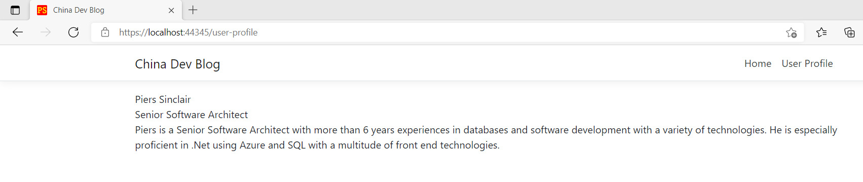 Figure: The initial user profile with no styling
Functional, but not very pretty!
Install Ant Design
Before we can begin making our profile pretty using Ant Design, we first need to install it. Run:
npm install antd
You may also have to install @babel/runtime and the latest @types/react to get Ant Design working
npm install @babel/runtime
npm install @types/react@latest
Add a Card
To start, let’s add a card that will improve the layout of our profile.
First, let’s import the card library into UserProfile.tsx
import { Card } from "antd";
Then import the Ant Design stylesheet into our index.tsx file.
import 'antd/dist/antd.css';
Now to use it, we can reference it like a normal React component. Super easy!
Populating the card
Let’s start simple and add a card that has a title and some info about us. Jump into the user profile component and replace the code in the react fragment with the following:
<Card title={FirstName + " " + Surname}>

    {JobTitle}<br />

    {Description}

</Card>
It should look something like this:
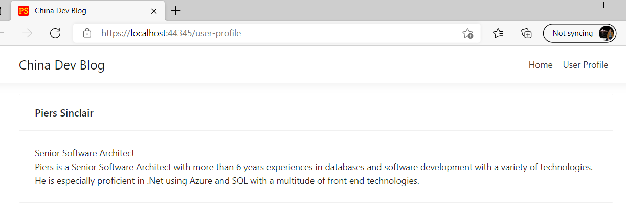 Figure: Our brand new card!
Adding images
To make our profile look more professional, we probably want to add a cover photo and avatar. The cover photo is easy, simply add the cover attribute to the card and reference an image in your repository:
cover={<img alt="example"
            src={require('../images/piers-cover.jpg')}
            className="cover-photo" />}
I’ve also added some rudimentary css to limit the height of the card and make it similar to a banner:
.cover-photo {
    max-height: 312px;
    object-fit: cover;
    object-position: 0 0;
}
The avatar is a little more difficult because we need to use something on the card called the Meta property. Cards use this property to give greater flexibility around metadata placement. To use the Meta property, define it in a constant as follows:
const { Meta } = Card;
Let’s also import the avatar library while we are at it:
import { Card, Avatar } from "antd";
Now that we have the Meta property we can introduce it into our card in any location we want. Let’s put it at the top and move our name and job title into the Meta property too. The card code should now look like this:
<Card
    cover={<img alt="example"
                src={require('../images/piers-cover.jpg')}
                className="cover-photo" />}>
    <Meta
        avatar={<Avatar src={require('../images/piers-avatar.jpg')} />}
        title={FirstName + " " + Surname}
        description={JobTitle}>
    </Meta>
    <br/>
    {Description}
</Card>
The UI is starting to shape up nicely:
 Figure: The card with a cover photo and avatar
Styling our card with Ant Design icons and actions
Now you might be wondering how you can add some nice buttons and functionality to your card? Ant Design has this covered too via the actions field that adds capabilities to the bottom of a card. Additionally, the library comes with built-in icons that you can use out of the box.
Let’s import an edit and settings button to put at the bottom of the card. First import the icons we need:
import { EditOutlined, SettingOutlined } from '@ant-design/icons';
Then add them as actions to the profile card:
<Card
    cover={<img alt="profile-cover-photo"
                src={require('../images/piers-cover.jpg')}
                className="cover-photo" />}
    actions={[
        <SettingOutlined key="setting" />,
        <EditOutlined key="edit" />
    ]}>
We won’t make them functional for now, but you could add functionality by simply handling the onClick event. Here’s the final product:
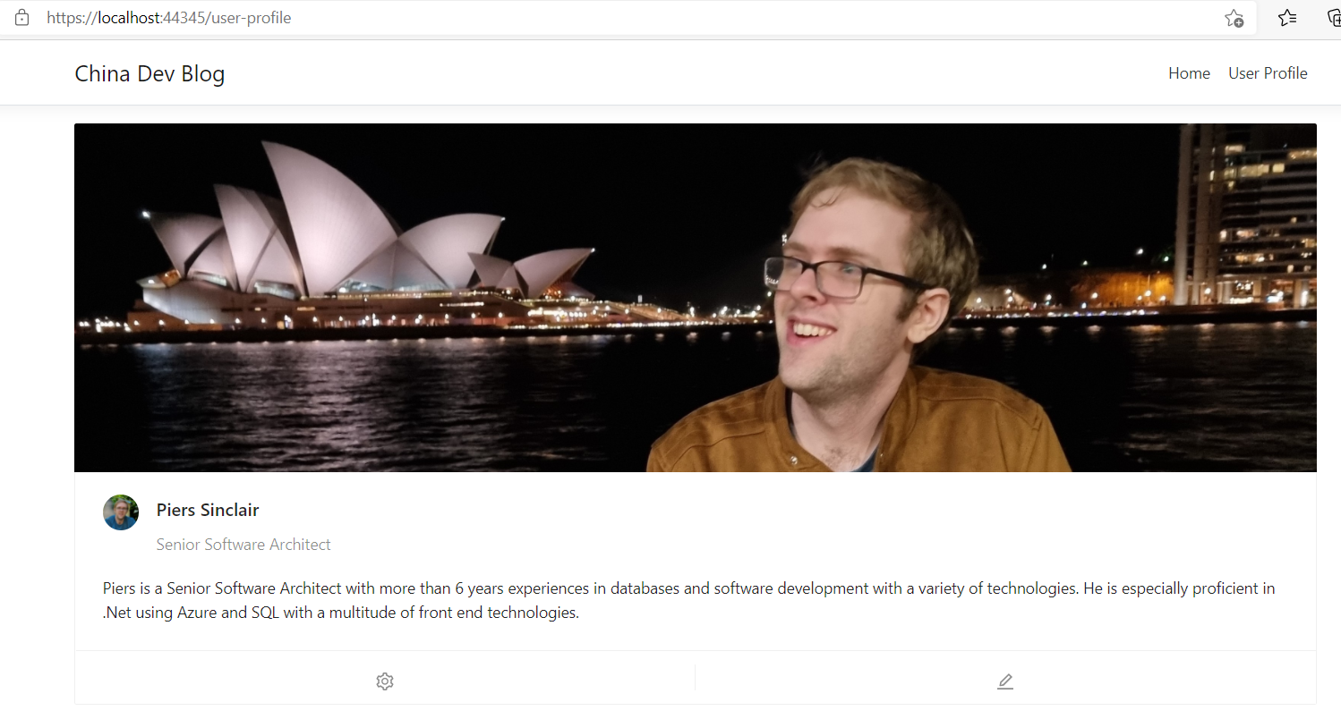 Figure: The slick final product
There we have it! As easy as 1, 2, 3 and we have a beautiful looking user profile on our website ready to be extended with further functionality.
You can view my website source code at China Dev Blog